
Monday 19 October 2015
Digipak photos
These are the pictures that I used for my digipak photoshoot. I used three images to project on a white pop up screen. Below are the pictures that I used and then below that is a slide show of all of my images that I got from my digipak photoshoot:
Thursday 15 October 2015
Digipak photoshoot - 14/10/15
Yesterday as a group we all took our different pictures with our different backgrounds. For the equipment we used a pop up white screen and a Mac laptop with a portable projector.


Tuesday 13 October 2015
Digipak photoshoot - 13/10/15
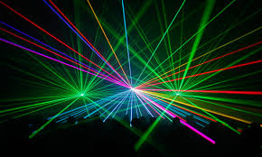
 Tomorrow I will be taking pictures of my artists for my digipak and poster. The front cover of my digipak will feature a crowd shot and lasers so for my photo shoot I want to use projections of lasers on my artists face and have a dark lighting to fit the tone of my digipak. I would like my artist to wear a plain black dress so the lasers can stand out and be the main theme in my digipak. For the artist, I will be using one of my group members named Sophie. I would like to have my artist to wear not a lot of makeup because as a DJ these type of artists aren't portrayed as heavily wearing makeup. Below are some pictures of how I would like my pictures to turn out:
The picture on the right side is what I would like my pictures to look like with the lasers projecting on my artist. With the projections I want the artist to be visible but I want it to be dark enough so the lasers are fully shown.

Monday 12 October 2015
Poster planning/rough drafts
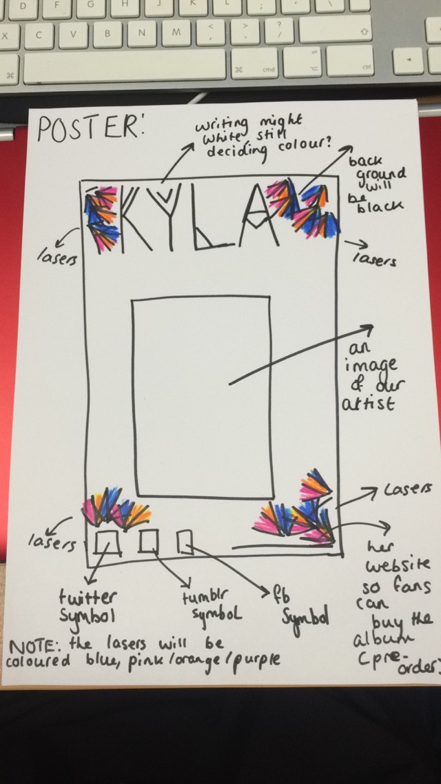 This is my rough draft that I have drawn out of my poster that I will make. In my poster I will corporate lasers just like I have done in most of the panels of my digipak so they all link. I still need to decide what colour writing I want for my artists' name as this will be important for the whole concept of both my digipak and poster. The image will be placed in the center of my poster and I think I want the image to fade into the poster.
 Poster plan
Then in my poster I want to incorporate lasers which will be coloured purple, blue, pink and orange. I want to use lasers in my poster because I am going to use lasers in my digipak and want them to look similar and not look really different from each other.
Friday 9 October 2015
Digipak planning/rough drafts
Below are my rough drafts of my digipak, after putting these up I will start to make them on Photoshop and experiment with all the different ideas that I have. 


Choosing fonts for my digipak
 These are the fonts that I am looking at for my digipak. Once I found the ones I was interested in I drew them out so I could see what they would look like on my digipak.
When asking people about which font they preferred they all liked either the second one or the fourth one because they thought it suited the genre more compared to the others. I think I am going to go for the second font as it suits our genre and fits in well. It also fits with the overall theme of my digipak.
Thursday 8 October 2015
Analysis of digipaks using greenscreen
In this video I am discussing Lady Gaga's 'The Fame' digipak and I discuss how the pictures help Lady Gaga put across that she is a solo artist.
Analysis of poster using greenscreen
This is my analysis of Lady Gaga's 'Born This Way' promotional poster. I discussed the codes and conventions of a pop video and how this poster can relate to it.
Analysis of album promotional posters
http://prezi.com/ohxpbpycv2gr/?utm_campaign=share&utm_medium=copy
This is my prezi for the analysis of album promotional posters. I have spoken about Taylor Swift, Katy Perry, Lana Del rey and Lady Gaga and how their promotional posters convey the codes and conventions of each of their genres.
This is my prezi for the analysis of album promotional posters. I have spoken about Taylor Swift, Katy Perry, Lana Del rey and Lady Gaga and how their promotional posters convey the codes and conventions of each of their genres.
Analysis of digipaks
Below is my analysis of various digipaks, in the presentation I have commented on the codes and conventions of them and commented on the themes that run through them.
Wednesday 7 October 2015
Album artwork analysis
Below is my album artwork analysis presentation and in the presentation I discuss different album artworks that relate to our genre we are doing a music video in.
Digipak plan
For my digipak, I will start to firstly plan the front cover. For this I want to, recreate a festival scene but it is going to be inside rather than outside. I want to use photoshop to put a crowd on the front of my cover like this:

Then once this is done I want to recreate lasers to make it look like our artist is playing at a festival. I was thinking that I could blend in our artists' face with an image of her that we will take at one of our photoshoots. I want her face to fade in with the lasers but not be prominent enough that she is the main attraction, then I want to have her album title on one of the corners. I think the colours blue, purple and orange will be seen most of the time when it comes to my didipak as I want everything to have a connecting theme. This will be the type of lasers I will put onto my digipak:

I think for the track-listing there will also be lasers appearing as I want this to be a key subject when audiences look at my digipak. For the track-listing I want the lasers to come out of each corner and then make the songs stand out as they are all going in that direction. For the background of all my digipak panels I will make them either black or white because I want everything to stand out. I think for the genre, my group and I are creating a video I don't want my digipak to be just beaches and waves etc, I want to take a different look on it and look at the genre in a different way and incorporate the tropical feel to my digipak as well. I think this will be the type of look I go for and hopefully incorporate this type of style into each panel of my digipak:


Then once this is done I want to recreate lasers to make it look like our artist is playing at a festival. I was thinking that I could blend in our artists' face with an image of her that we will take at one of our photoshoots. I want her face to fade in with the lasers but not be prominent enough that she is the main attraction, then I want to have her album title on one of the corners. I think the colours blue, purple and orange will be seen most of the time when it comes to my didipak as I want everything to have a connecting theme. This will be the type of lasers I will put onto my digipak:
I think for the track-listing there will also be lasers appearing as I want this to be a key subject when audiences look at my digipak. For the track-listing I want the lasers to come out of each corner and then make the songs stand out as they are all going in that direction. For the background of all my digipak panels I will make them either black or white because I want everything to stand out. I think for the genre, my group and I are creating a video I don't want my digipak to be just beaches and waves etc, I want to take a different look on it and look at the genre in a different way and incorporate the tropical feel to my digipak as well. I think this will be the type of look I go for and hopefully incorporate this type of style into each panel of my digipak:

I think now I have a rough idea of what I want to do with each of my digipak panels and I will start to draw them and show rough ideas and then start to work on them on photoshop.
Tuesday 6 October 2015
Audience profile
 This is my audience profile that I created for my artist using photoshop. I have included the things that I think our target audience will find entertaining and also be interested in. For example, in the audience profile I included the symbols for social media websites like tumblr and twitter because this is what our target audience would be interested in as they are age ranged between 16-24. As our genre is tropical house, I decided to include outfits from festivals and examples of festivals' crowds. I also included lasers in my audience profile because this is what I want to include in my digipak and poster when I start to design it.
Monday 5 October 2015

Friday 2 October 2015
Final song choice
For our final song choice we have chosen 'I do' by Felix Jaehn. We have chosen this song because it fitted very well with the genre we wanted to go for which was tropical house. I think the fact that this song doesn't have a music video is important because our video won't be similar to anything and will be completely unique. For this music video we want to incorporate boho style clothing, and a more festival feel. We want our video to have a tropical feel so it can suit the genre we are going for. To achieve this we may include scenes from various festivals that this song has been played at or even create our own type of festival and film it ourselves.
For the location of our video we were thinking of filming in a park that has a river because there would be many shots that we could incorporate with this type of location. As the weather is changing, we need to shoot most of our footage in the day time so we can get the tropical feel incorporated in our video. However, when filming the festival scenes we will certainly film during the night time because this is when it will look its best.
Below is a clip of the song we have chosen:
Thursday 1 October 2015
Mood boards
Before creating our digipaks we were asked to create a mood board which would show what kind of genre we wanted our music video to be and what elements we were going to include. Below are pictures that we took of our mood board:
Subscribe to:
Posts (Atom)